Our Approach
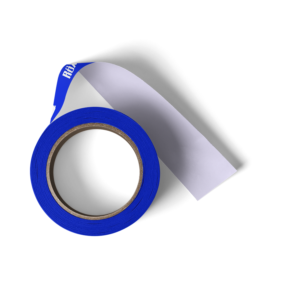
For ROXXLOXX™,a hair care brand focused on women with locs and natural hair, our rebranding aimed to create a distinctive identity in a competitive market. We emphasized the brand's commitment to quality, expertise, and transparency, developing a bold visual identity that celebrates the beauty of locs. Messaging was crafted to resonate with both consumers and professional stylists, positioning RoxxLoxx as a leader in loc and natural hair care. This strategic approach elevated the brand's presence and fostered a deeper connection with its audience, paving the way for future growth.
typography
The logo for RoxxLoxx features a carefully crafted typographic pairing that embodies the brand's identity. For the "Roxx" part, we chose the font Sacco, which balances readability with a bold and edgy character. The tall typeface allows for strong visibility, while we customized the locket by combining the letters "R" and "O" to create a unique, impactful visual that conveys power and confidence at first glance. This approach ensures that the brand makes a striking impression, essential in a competitive market.
For the "Loxx" part, we selected TC October, a font that complements Sacco. This typeface was chosen not only for its aesthetic appeal but also because it resembles the texture of locs, reinforcing the brand's focus on hair care for this specific audience. The use of all caps gives it a confident presence.


Loxx-Tricity
Conveys an energetic and bold approach to hair care
lightning
color symbolizes the genuine nature of the brand
royalty
Conveys professionalism, trust, and reliability
dark
convey a sense of and premium quality hair care and service
Light
Commitment to transparency and authenticity
Responsive Logo suite
The responsive logo suite for RoxxLoxx™ is designed to maintain brand integrity across various platforms, featuring multiple variations for optimal visibility and recognition. The full logo is great for large spaces like flyers or banners, while simpler versions ensure clarity on smaller items like business cards or social media profiles. By having these variations, Roxxloxx™ brand stays consistent, flexible, and easy to recognize no matter where it’s used, whether online or in print. This way, she can maintain a professional look while adapting to different situations.

roxxloxx™ website


